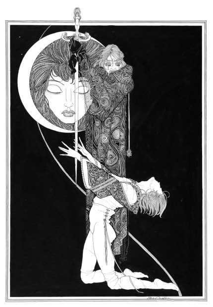
I think if British illustrator John Archibald Austen (1886-1948) had been living a few decades later, in the second half of the 20th century, today he would probably be known as a brilliant graphic novel artist. To back up my theory, I think it’s enough to take a close look at one of his earlier works, a black-and-white illustrated version of Shakespeare’s Hamlet, published in 1922 by Selwyn & Blount in London.
All of Austen’s biographies mention that at the beginning of his career, when he arrived to London in 1906 with the intent to become an artist, he took inspiration from Aubrey Beardsley (1872-1898), the most influential and innovative (and controversial) graphic artist of the 1890s. BTW, this is something that is true for pretty much every illustrator of the early 1900s…
Austen’s pen-and-ink drawings for Hamlet clearly show this influence in composition and in details, although the features of his characters – especially Hamlet and Ophelia – have a distinct style that would be described today as surprisingly manga-like. Many argue that there’s a strong resemblance to the illustrations of Irish artist Harry Clarke, who was a personal good friend of Austen, and owes a lot to Beardsley’s work himself – and the circle is nicely closed :). These connections are obviously there, but I think beside that in Hamlet Austen has created something unique as well: most of his scenes have an exaggerated dynamic that seems so overblown that it almost feels inappropriate if you take his drawings as traditional illustrations meant to accompany a text. Both Beardsley and Clarke made some disturbingly pictorial illustrations to emotionally poignant and action-loaded, blood-thirsty stories, but the dynamic I feel with Hamlet is not there.
Even if not in movement, Austen’s characters and compositions have a certain inner tension radiating from them that is very unusual among the book illustrations created in that period. But if you look at the drawings on their own, the overdramatic facial expressions, gestures, and moves tell you a story without text, and they can easily be seen as in-progress stills from a graphic novel in classic black-and-white 1980s style (think Frank Miller…).
These qualities aren’t present in any other illustrations in Austen’s body of work (…that I’ve seen so far). His next book – illustrations for Tales of Passed Times, a collection of Charles Perrault’s fairy tales – published the same year has a very different graphic style. His drawings are playful but mature and confident, a combination of ornate, delicate details and bold, simple colors, most of them in creatively arranged long landscape format compositions. In his later works like Haidée and Juan (Don Juan, ca. 1926) he adapts a fine Art Deco style (not so interesting in my opinion) – but these are all traditional book illustrations.
Austen was undoubtedly a very talented artist, changing his graphic style like a chameleon to fit the nature of the text he was working with, so it makes me wonder why he never returned to the overdone dynamics he created for Hamlet. If he had done it, maybe today he would be considered a pioneer of the graphic novel genre…
For prints and for more illustrations from Austen’s Hamlet please visit our store. The drawings are scanned from an original copy (now in private collection) of the 1922 book, in high resolution, and digitally cleaned to preserve the delicate fineness and distinctive aesthetics of Austen’s work.


